
 L Lemo-Opuscar
等距信息图
一杯咖啡从种植园到你手里的旅程。
- 适合:
- 一个小世界、一套流程
- 系列:
- L Lemo-Opuscar
- 更新:
- 2026-10-29
风格提示词
Isometric Infographic — Style Prompt
A system diagram comes alive: an isometric diorama of flat three-tone blocks, thin ink labels and Isotype numbers, where things open up to show their insides and the numbers are drawn, not stated.
References (grammar only): Monument Valley (true-isometric architecture, flat colour blocks, three fixed tones per face, a camera that pans and zooms but never breaks the projection); SimCity 2000-style cutaway dioramas (a floating board with soil strata, the whole system visible at once); Kurzgesagt (a question, a steady push forward, one clear visual metaphor per step, a change of scale when a number is too big to feel); Isotype, Otto Neurath / Gerd Arntz (repeated identical icons stand for quantity); Powers of Ten (a continuous dive through nested scales). Use none of their characters, buildings, icons, palettes or music.
1. Essence, and what it is not
- Flat, true isometric. No perspective, no outlines on solids; shapes are separated only by the three tones of each face. The projection never rotates or tilts.
- Infographic furniture is part of the picture: leader lines, label pins, dashed cut lines, hatched section faces, tracking rings, a legend, a route line all live in the world.
- Numbers are built from icons (Isotype), and they add up.
- A diorama: the system sits on a floating board or plinth with a visible cross-section at its edges, on a pale ground.
Not low-poly 3D (no perspective, no lighting beyond three face tones), not a flat 2D explainer (everything has isometric depth), not a blueprint (colour blocks, not line drawings on blue).
2. Materials & rendering
- Projection: axes at 30°.
sx = (x − y)·cos30°·k,sy = ((x + y)·½ − z)·k; x runs down-right, y down-left, z up; painter depth = x + y + z. Everything is queued and depth-sorted, then flushed. - Three tones per face chosen from its normal: top light, left (+y) mid, right (+x) dark. Derive tones from one base colour: mix toward warm white ~20 % for the top and toward a cool dark (e.g.
#231A2C) ~22 % for the dark side, so shadows are slightly cool. - Ink lines (2 px) only for infographic elements: leaders, pins, cut lines, rings, routes, labels.
- The board: floats on a pale background with a faint isometric dot lattice and a soft blurred shadow; its front faces show strata (soil, water column, floors, pipes) where the section meets the edge.
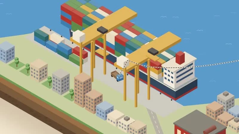
- Composites (a terraced hill with shrubs, a crane over a ship) are drawn as one ordered item or given a depth bias; generic painter sorting fails on them.
- People: minimal billboards (round head, tapered two-tone body, a thick arm stroke, a hat or hair shape for identity, no faces), stepping at 12 fps.
- Close-ups of hands or objects: flat faceted shapes in three tones, same logic as the blocks.
- Level of detail by zoom: skip small world detail at high zoom, fade tall objects in by zoom so a pull-out never sweeps a giant shape through the frame.
3. Colour logic
- A pale neutral ground (cream, paper grey or pale blue) and 5–7 flat hues, each with its three tones; one ink colour.
- Colour codes meaning, the way a legend does: one hue per material or role (water is always the same blue, the subject always its hue). Never reuse a hue for two meanings.
- The subject's hue is reserved: when the story needs "this one", everything else desaturates toward warm grey and only the subject keeps its colour (focus + context).
- Stations that must be found in a wide shot get a pale plate with a dashed ink outline plus one accent hue.
- Examples: a recycling chain — bottle green, kraft brown, can silver-blue, compost umber, mustard on cream; a hospital — teal, coral, lavender, steel grey on pale grey; a data centre — electric blue, amber, graphite, mint on off-white.
4. Type & subtitles
- One geometric sans (e.g. Jost): titles 600 all caps with ~0.12 em tracking, numbers 400 large (~44 px), units at half size. All text has a ~7 px halo in the ground colour so it reads over any block.
- Label pins: dot (ink ring, pale fill) → vertical leader → horizontal rule → text. Pins point up or down, left or right, chosen per station so labels never cover the subject.
- Titles can be isometric type on a world plane, extruded as blocks.
- The subtitle is a map label: a pale card with a small radius and an ink border, a tiny iso cube as legend chip, sans ~42 px, bottom-centre; border draws first, text wipes in. Keep the bottom ~170 px clear for it. Hold ≥ max(1.8 s, speech + 0.6 s); lines never overlap titles or other lines.
- An end frame can be the legend: title, totals, the Isotype key, credits, "NOT TO SCALE".
5. Motion quality
- Nothing moves without a line leading it: a route line is drawn slightly ahead, a leader grows before an inset opens, a cut line draws before a skin slides away.
- Cutaway: cut line (~0.3 s) → the near skin slides out along its normal and fades (~0.35 s, ease-out) → hatched section rims fade in over the last part.
- Isotype fill: icons pop with a back-ease (overshoot), one per subdivision of the beat; count-up numbers run over the same span.
- Accumulation = acceleration: arrivals on quarter notes, then eighths, then waves; the eye feels the system taking over. Solids arrive by motion, never by alpha (semi-transparent blocks look like ghosts).
- Objects perform: squash on landing (~18 %) and small bounces; colour changes that show a process (raw → cooked, empty → full).
- Vehicles follow polylines with ease-in-out and face their tangent.
6. Camera grammar
A vocabulary, not a route. The camera is a world centre plus a log-interpolated zoom k (px per unit); the projection never changes. Opening and ending come from the topic.
| Move | What it expresses | Can serve |
|---|---|---|
| Follow along a route | process; cause → effect | a supply chain; a journey; a signal |
| Hold wide + circular inset | the system and the individual together | one worker in a factory; one cell in an organ |
| Push through nested cutaways | a fall into scale; finding one thing among millions | a needle in a haystack; inside a machine |
| Fast log pull-out | release; the big picture after a detail | scale reveal; a statistic made physical |
| Locked frame while things accumulate | a system filling up; overload | a queue; traffic; data growing |
| Lateral follow over emptiness | a breath; distance | an ocean; a wait; a quiet phase |
| Top-to-bottom tilt through strata | layers; depth; history | geology; a city's underground; a software stack |
| Switch boards (a second diorama) | before/after; here vs there | two cities; two eras; two designs |
Framing: the subject ≥ 1/3 of frame height at key moments; labels never cover it; the subtitle zone stays clear. One continuous take is one option; a cut to a new board or an inset is another.
7. Sound palette
- Music: acoustic and light: kalimba, marimba, nylon guitar, pizzicato, woodblock and hand percussion (shaker, bongo, cajon), upright or synth bass, glockenspiel, toy piano, or a clean electronic pulse for technical systems. A short motif can mark the subject each time it appears.
- Techniques (options): one sound per icon as numbers fill; instruments dropping out and a low-pass closing as the camera dives; J-cuts (the next station's sound 0.5 s before it appears); one note per station during a final pull-back.
- Ambience beds per station, crossfaded (wind and birds, harbour, sea, city hum, machine room, crowd murmur).
- Foley by material: fibre snap, fleshy thud, grains pouring, granular rattles, inharmonic steel partials for containers, paper tear, ceramic plink, liquid pour with rising pitch, servo whine, keyboard clicks.
- Silence: digital zero or one faint sound; the first sound after it should be one of the most important in the film.
- Mix: music ducked ~8 dB under voice, ambience ~7 dB; keep high-band beds (2.5–7 kHz) very low under speech or whisper mishears words. Final −14 LUFS.
- Voice: clear, friendly explainer; short lines.
8. Native moves
A menu: use the ones your story needs.
- Cutaway. Cut line, skin slides away, hatched rims remain. Fits content like: a heart's chambers; a server rack; a beehive.
- Isotype number. Identical icons in a new arrangement each time (a calendar, a bar, a silhouette formed by the icons themselves). Fits content like: votes in an election; litres of water per product; users of an app.
- Focus + context. Everything greys except the subject. Fits content like: one patient in a hospital; one packet in a network; one tree in a forest.
- Frame within the frame. A leader grows into a circular inset with a close-up. Fits content like: a chip on a circuit board; a worker's hands; a crack in a bridge.
- Scale reveal. Pull back until every label is on screen and the last frame is a finished infographic. Fits content like: how a city is powered; a school's day; a festival site.
- Tracked subject. One object followed with a "you are here" ring. Fits content like: a letter through the post; a drop through a water plant; a vaccine dose.
- Strata cross-section. The board's edge becomes the story (layers added or removed). Fits content like: a mine; an archaeological dig; a building's floors.
9. Pitfalls of the medium
- Newell normals depend on vertex order: faces get culled as back faces → give every face an outward hint and flip the normal to match before culling.
- Painter sorting breaks on composites → draw them as one ordered item; add depth bias for overhangs.
- Semi-transparent moving solids look like ghosts → motion only, no alpha.
- A hull or wheel touching the wrong surface reads as an accident → leave visible clearance.
- World geometry behind a close-up becomes giant discs → skip detail above a zoom threshold, paint a flat backdrop behind hero layers.
- A pull-out through a tall object gives one ugly frame → fade tall objects in by zoom.
- Hidden jumps (a time or place change during a dive) must be drawn in screen space anchored on the tracked subject, so the frame doesn't reveal the jump.
- An object drawn with the wrong silhouette reads as something else (a white box with a red roof is a house) → give machines their tell-tale parts.
10. Engine
demo/engine.js is dependency-free Canvas 2D: Iso (projection, camera, depth-sorted queue: box, prism, cyl, cone, roof, sphere, flat, line3, bill, text3, push/pop local frames, desat + keep one-colour hook), tri() three-tone generator, pin, inset, cutLine, hatch, ring, ICON.* + iconGrid, person, and shape() which turns any 2D outline into a shaded isometric solid. API table and a minimal example (a shape the demo never uses): DEMO.md "Engine reference".
11. Variation space
You decide the system, the board (or several), whether there is a tracked subject, the numbers, the camera path, the opening and the ending. All far from our demo:
- Structures: one building, floor by floor (a tilt down through a cutaway tower, each floor a step); two boards compared (the same system in two places or eras, alternating, then side by side); a cycle (a loop route that returns to its start with one number changed each lap).
- Openings: the finished infographic, which then comes apart into its moving parts; one icon that multiplies until it becomes the landscape; a question written as an isometric title on an empty board.
- Endings: an unanswered station (the route stops at an empty plate with a question mark); the legend alone, the board faded out; a close-up of a single icon, the whole number behind it out of focus.
How our demo was made (story, shots, score, end card, build): DEMO.md. Read it after your treatment exists.
补充
示范片
From Bean to Cup
本风格的来源项目:开源项目 Lemo-Opuscar(项目仓库)。本站保留原项目署名,具体许可以该项目仓库为准。
分享来源:B 站视频(341 种代码动画风格)