
 L Lemo-Opuscar
60s 间谍片头
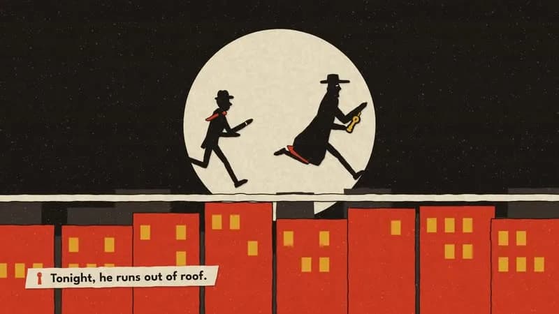
虚构 1964 年间谍片的片头:追一把被偷的钥匙,几何碎片最后拼成片名。
- 适合:
- 片头、悬念
- 系列:
- L Lemo-Opuscar
- 更新:
- 2026-10-29
风格提示词
60s Spy Title Sequence — Style Prompt
A cut-paper, four-ink opening title sequence for a film that never existed: silhouettes move through sets built out of the credits themselves, every brass stab is a cut, and a title is assembled from the pieces.
References (grammar only): Saul Bass's titles for North by Northwest, Anatomy of a Murder and Vertigo (flat opaque inks, abstraction down to silhouettes, type as structure); the 2002 homage by Kuntzel + Deygas for Catch Me If You Can (a cut-paper chase through graphic sets, lateral tracking). Not a gun-barrel opening, not a tiptoeing cartoon panther, not a copy of any real title's logo, lettering, characters or shots.
1. Essence, and what it is not
- Flat, opaque inks on paper: four colours, no gradients.
- Hand-cut edges on every shape; pieces layered with cut gaps and small paper shadows.
- Abstraction down to silhouettes: figures in profile, all acting in outline and timing.
- Typography is the picture's structure: credits are architecture, props, vehicles.
- Music cuts the picture: brass stabs are edit points.
- A title sequence is a story in itself: one goal, a few locations, one reveal.
Not flat vector motion graphics (the edges are cut, the paper is physical), not a halftone print style (no dots), not a Swiss grid (diagonals, jaunty type, playful), not a spy parody with gadgets and gun barrels.
2. Materials & rendering
- Scissor-cut edges: every polygon resampled every ~9–10 px and displaced along its normal by low-frequency noise (amp ~1.2–2.2 px, larger for bigger shapes) plus a rare 1–2 px notch. Cut the edge once in the piece's local space and cache it, so a moving cutout keeps the same edge, exactly like real cutout animation (screen-space edges crawl).
- Paper layering: separate pieces are separated by a ~2.4 px cut gap in the ground colour and cast a small paper shadow (offset a few px, blur ~5, alpha ~0.3). Whole figures get the gap as an outline, so a black figure reads in front of a black letter.
- Paper texture: one full-frame texture multiplied on top (mottling + faint fibres), a sparse "ink void" speckle on dark ink, faint squeegee streaks; film grain in the mux (~6).
- Silhouette figures: tall stylised adults (~7 heads), identity by hat, coat cut, shoes and one colour accent that doubles as a motion indicator (a tie or scarf streaming back when running). Pieces merge into one outline inside the figure, with only thin slits at shoulder, elbow, hip and knee. Hands are sharp wedges; no faces except an eye slit in close-ups.
- The object of the chase sits on a black backing (an ink keyline) so it reads on any ground; it is the brightest thing in frame.
- Type: a condensed OFL display face (e.g. League Gothic) for credits, glyph outlines extracted (opentype.js) and re-cut per letter (edge noise, ±0.8° rotation, ±1.5 px baseline jitter). A title in custom geometric cut glyphs (straight cuts + arcs, uneven weights, staggered baselines), never a real title's lettering.
3. Colour logic
- Four inks: ink black, paper cream, one hot colour, one warm secondary. Darker "shadow paper" variants of those inks only for depth.
- One dominant ground colour per scene, changing with the location; figures and type in the other inks.
- The hot colour is reserved for one accent on the hero and for danger; the secondary marks the object of the chase.
- Background props go in a darker version of the ground, never in black, or they read as letters.
- Examples: black
#1b1714/ cream#efe4c9/ red#d23a22/ mustard#e2a52a; ink#161a22/ bone#ece6d6/ teal#1f8a8a/ orange#f07a28; black / pale pink#f3d6cc/ cobalt#2a46b8/ lemon#f0d23a.
4. Type & subtitles
- Credits live in the set, never in the subtitle band: one line per location, fully readable at some moment. Credits are fictional roles only, never real people's names.
- Subtitles on a narrow paper strip (scissor-cut ends, slightly tilted) bottom-left, a small glyph from the film as bullet, a geometric OFL sans (e.g. League Spartan 600, ~44 px). Light strip on dark scenes, dark strip on light scenes; slides in from the left in ~0.18 s. Hold ≥ max(1.8 s, speech + 0.6 s).
- Hold each credit long enough to read alongside a subtitle.
5. Motion quality
- Puppets on twos (12 fps): poses and positions of figures, hands, letters landing, vehicles. Camera, credit slides and grid growth on ones (24 fps): a stepped camera judders.
- Run cycles of ~8 drawings, one step per beat, a strong lean, the accent flying back. Walks one step per beat, coats swinging.
- Credits slide in along grid lines and stop dead on the beat (short ease-out); letters land with a paper slap.
- Stop-time: at a stab the whole picture freezes (background scroll included) for a couple of beats in total silence, then resumes.
- Shattering: a scene sliced into strips parallel to a cut line that slide off alternately along the diagonal.
6. Camera grammar
A vocabulary, not a route. Graphic, flat, decisive. Opening and ending come from the topic.
| Move | What it expresses | Can serve |
|---|---|---|
| Wide on a full credit line, then truck in | reading, then action | any location built from type |
| Lateral tracking, one screen direction | pursuit; momentum | a chase; a race; a delivery |
| Hard cut on a brass stab | punch; a new location | montage; a reveal; a gag |
| Graphic match cut (same shape, same position) | rhyme; acceleration | wheel → coin → pupil → moon |
| Locked single shape on a flat ground | mystery; an icon | a cold open; a clue; a logo |
| Silhouette against a giant circle | the hero moment | a catch; a triumph; a stand-off |
| Diagonal split into a grid | fragmentation; many at once | a split screen; a conspiracy; a team |
| Vertical pan down a column of type | descent; a list | a building; a roster; a countdown |
| Push into a letter until it fills frame | a letter becomes a place | a door; a tunnel; a window |
Framing: strong diagonals (~30°), big flat grounds, figures small against type. Match cuts keep circle centres and sizes identical across the cut. No dissolves.
7. Sound palette
- 1960s spy big band: stacked staccato trumpets and trombones in octaves with crash (the stab), surf guitar low-string twang through a spring reverb, walking upright bass, brushes or sticks, bongos and shakers, vibraphone, flute, organ stabs, harpsichord. Minor keys, chromatic lines, dotted rhythms. Original motifs only: avoid the famous chromatic crawl of the most famous spy theme and its minor-major-ninth ending chord.
- Stabs = edit points: place staccato brass ~8 ms early so the sample's peak hits the frame.
- Techniques (options): a cut interval that shrinks as a chase accelerates; stop-time silence; a big chord for the title followed by a short button; a solo instrument alone for a quiet scene.
- Foley follows the material: paper (cut "shh", slides, card slaps for letters landing, blind flips, a tear), metal (keys, chains, locks, clicks), tape (click, hiss). Environments only hinted: a jet pass panned, train wheels in tempo, roulette ticks slowing, wind, a phone ring, footsteps on stairs.
- Silence: true zero, reverb tails included; a single tape click or hiss may remain.
- Mix: music ducks ~7 dB under voice; a peaky mix needs a few dB into a limiter before loudnorm to reach −14 LUFS.
- Voice: a briefing through a tape chain (band-pass ~220–5200 Hz, soft saturation, slow wow, hiss rising under the voice); a few very short lines.
8. Native moves
A menu: use the ones your story needs.
- Type is the set. Each location is one line of credits and that line is its architecture (letters as pillars, words as carriages, a letter as a lock). Fits content like: a conference programme as a city; a menu as a restaurant; team names as a stadium.
- Credits are rhythm. Credits land on beats; stabs are cuts. Fits content like: a product's features; a festival line-up; an award's nominees.
- Graphic match cuts. Shape rhymes, the interval shrinking as tension rises. Fits content like: a coin → a planet → a clock; a gear → a wheel → a sun.
- The diagonal grid. A diagonal cut multiplies into a grid, and the pieces later fly back along it to assemble something. Fits content like: a puzzle solved; a team forming; a logo assembled.
- Silhouette puppets. Profile cut-outs whose acting is outline and timing. Fits content like: a heist; a courier on a deadline; a detective.
- Stop-time gag. Freeze on a stab, silence, resume. Fits content like: a near miss; a double take; a price reveal.
- The object of the chase is the title. What everyone pursues becomes the last thing assembled. Fits content like: a product launch; a book's name; a birthday name.
9. Pitfalls of the medium
- Every internal piece outlined with a gap looks like a mannequin diagram → merge pieces in an offscreen layer, cut only joint slits (
destination-out), outline the whole figure. - A
clear()that resets the transform silently kills the camera. - A figure fully hidden behind a letter reads as "nobody there" → let hat, nose and accent stick out. A stiff streamer reads as a tongue → multi-segment ribbon with a travelling sine.
- A credit only ever seen partially is uncomfortable → always open wide on the full line.
- Black background props read as letters → darker ground colour.
- An object in the same ink as its ground vanishes → black backing.
- Circular props dropped into a word cover neighbouring letters → lay the word out around a gap.
- Match cuts fail if circle centres move across the cut.
- Flat inks + grain make huge files at low CRF → a higher CRF looks the same.
10. Engine
In demo/: paper.js (four inks, cached scissor edges, cut gaps, paper shadow, texture, silhouette layer with joint slits), glyph.js (League Gothic → opentype.js outlines → re-cut letters), chars.js (silhouette rigs, poses, run/walk cycles), title.js (custom cut title glyphs, diagonal split), story.js (tempo grid, single source of timing), film.js (timeline, acting, cameras, subtitles, sound events). ?sheet=1 renders a model sheet, ?frame=<scene> a style frame. File list and build steps: DEMO.md "Build notes".
11. Variation space
You decide what is pursued, by whom, the locations (as credits), the inks, the opening and the ending. All far from our demo:
- Structures: no chase: a countdown (ten credits, ten locations, a bomb-clock number built from type in each); a heist in reverse (the object is returned, location by location, to where it belongs); two agents, one frame (split diagonally, each side a different ground colour, until they meet).
- Openings: a full-frame title that shatters into the sequence (the reveal moved to the start); a telephone rings in a single cut-out room; the hero already falling through a column of type.
- Endings: the title never assembles, one piece missing, the hero walking off with it; a slow pull-out showing every location was one giant credit page; a stop-time freeze on the final stab, held.
How our demo was made (story, shots, score, end card, build): DEMO.md. Read it after your treatment exists.
补充
示范片
The Velvet Cipher
本风格的来源项目:开源项目 Lemo-Opuscar(项目仓库)。本站保留原项目署名,具体许可以该项目仓库为准。
分享来源:B 站视频(341 种代码动画风格)