
 L Lemo-Opuscar
瑞士动态排版
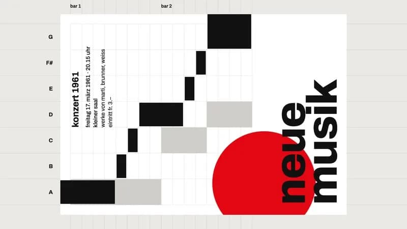
一张音乐会海报按瑞士设计的五条规则自己排版,第五条是只打破一条。
- 适合:
- 干净的文字排版
- 系列:
- L Lemo-Opuscar
- 更新:
- 2026-10-29
风格提示词
Swiss Motion Graphics — Style Prompt
International Typographic Style in motion: a modular grid, one typeface, one signal colour, and movement as exact as a printing press.
References (grammar only): 1950s–70s Zurich posters (Müller-Brockmann, Hofmann, Gerstner, Crouwel) for the grid, flush-left type, scale contrast and "designing programmes"; modern identity systems in motion (Experimental Jetset, Pentagram) for snaps on the beat. Never copy a specific historical poster's composition (no concentric-circle or fan layouts lifted from Müller-Brockmann), never use Helvetica or Akzidenz font files, never name a real institution on a poster.
1. Essence, and what it is not
- Pure 2D graphic design animated on a grid: flat paper, black type and bars, a very light grey and one saturated signal colour.
- Every element snaps to the grid, every move lands on a beat, nothing bounces.
- Rigor with one exception: the whole frame obeys a system, so the one element that doesn't becomes a character.
- Extreme scale contrast: a giant numeral next to tiny technical notes.
Not a keynote (no gradients, no glow, no device renders), not kinetic typography for a lyric video (words don't fly, spin or bounce), not data visualisation (bars have mass as graphic form, not as charted quantities, unless the grid gives them that meaning), not a Bauhaus pastiche of primary shapes.
2. Materials & rendering
- Frame grid: 1920×1080, 12 columns, ~96 px side margins, 24 px gutters, 24 px baseline. The frame can act as a spread: a left page (the programme: numeral, rule text, notes) and a right page (the artifact).
- Artifact grid derived from the content (Gerstner): what the columns and rows mean is a design decision. Choose module sizes that give the elements mass; too many thin columns make a layout look like a chart.
- Surfaces: page, paper, ink, signal colour, grid lines in two or three light greys (on page, while building, on paper). No gradients, no shadows, no particles, no grain (mux grain 0).
- Bars and blocks are flat rects; consecutive cells of one unit merge into one bar, overdrawn 1 px at seams (antialiasing shows hairlines, especially when rotated or scaled).
- A secondary voice can be light-grey elements under the black ones: depth without a second colour.
- A 2D camera matrix (centre, scale, rotation) for all moves.
3. Colour logic
- Paper, ink, greys, and one signal colour. Only one thing carries the signal colour; that makes it the protagonist. It is the only thing allowed to be inexact.
- Overprint is allowed: black type on the signal colour.
- The signal colour can be red, orange, ultramarine or green; choose it for the topic, then never add a second.
- Examples:
#EAE9E5page,#FFFFFFpaper,#111111ink, signal#E30613; or#F2F0EA/#141414/ signal#FF5A00; or#E9ECEF/#0B0B0B/ signal#1F3FFF.
4. Type & subtitles
- One family for the whole film, an OFL neo-grotesque (Archivo, Inter, Schibsted Grotesk, Instrument Sans…), several weights. Letter-spacing ~−2 % at ≥ 90 px. Headlines can be lowercase. Load every weight with
document.fonts.loadbefore drawing. - Flush left, ragged right; everything on a grid line; big white space is part of the layout. Giant numerals are optically flush left (subtract the glyph's left bearing).
- Subtitles are part of the layout, not a bar at the bottom: each line sits at a column start in the current composition (a small grey lead-in + a large bold statement, or a caption like a museum label), each word clip-revealed on its whisper timestamp. Hold ≥ max(1.8 s, speech + 0.6 s); assert it in code.
- Caption rows: small (~19 px) medium-weight notes with a 1 px rule above; technical notes in a corner (module sizes, counts, a bar counter).
5. Motion quality
- Two curves only: a precise ease
cubic-bezier(.7,0,.2,1)for snaps; linear for lines being drawn, playheads and the exception. No overshoot, no spring, no bounce. - Durations are note values at the film's tempo. A snap starts one note value early and lands on the beat.
- Entrances are wipes or clip-reveals, never fades: words rise out of a clip rect from below the baseline and leave upward; lines grow along their length; paper appears by a wipe; big numerals climb in eased steps ("one module at a time").
- Deletions are knife cuts: a thin line crosses the element, then the element collapses to its midline.
- Ripples are ordered by distance from their cause, a couple of units per subdivision.
- The exception moves differently: linear, unsnapped, perhaps pausing mid-flight; a coordinate readout beside it can turn from "on grid" to "off grid".
- Smooth 24 fps, no stepping: digital precision, not hand-made.
6. Camera grammar
A vocabulary, not a route. The camera moves only with the precise ease and only on beats. Opening and ending come from the topic.
| Move | What it expresses | Can serve |
|---|---|---|
| Locked spread | cause (left) → effect (right) | a rule applied; a before/after; a comparison |
| Hard pan by one page or column | the next step in a system | a sequence; a catalogue; a timeline |
| Rotate 90° and stop | the same thing read another way | a poster as a score; a chart as a map |
| Pull out to a wall of artifacts | one programme, many outputs | a brand system; a product range; a series |
| Push into one module | detail; the unit of the system | a pixel; a letter; a single data point |
| Grid extends past the page | the system is bigger than the artifact | scale; ambition; a break from constraints |
| Split frame into equal cells | parallel cases | options; variants; team members |
| Vertical scroll through a column | reading; a list | a manifesto; a spec sheet; a timetable |
Framing: everything on the grid; the signal element may sit off-grid only when it is being the exception. Transitions are wipes, knife cuts, camera moves and re-flows; never dissolves.
7. Sound palette
- Music with a grid of its own: a steady pulse whose subdivisions give snap durations. Options: motorik / krautrock kit and bass, minimal techno, marimba or vibraphone patterns, a mechanical piano ostinato, a drum machine with a glockenspiel; one instrument added per new rule is a clear build.
- Picture and music can share one data file (a column → pitch, a row → onset), so a graphic can literally be the score.
- Techniques (options): drop the drums for the one moment of the exception; a near-silent bar before a reveal; thin the band during a reveal so every note is audible.
- Foley follows the materials of print, dry and close, no reverb: letterpress clack, ruling pen "tss", guillotine snick, paper slap and slide, numeral thunk, block snap, felt thump for a landing, rubber stamp, typewriter carriage.
- The exception can be the only element that sings (a sine glide following its position).
- Silence: a hard stop of everything on a downbeat; the next snap reads as an event.
- Mix: voice compressed and ≥ 6 dB above music, music ducked ~10 dB under voice, −14 LUFS.
- Voice: cool, crisp, rule-like sentences; prefer voices with bright consonants.
8. Native moves
A menu: use the ones your story needs.
- The grid means something. Columns and rows become a quantity (notes, hours, floors, years). Fits content like: a building's floors and rooms; a week's timetable; a city's districts.
- Snap = beat. Every arrival is a percussion hit. Fits content like: a product's feature list; the steps of a recipe; a countdown.
- Programme. Rules applied one by one to one artifact, then the same programme generating many. Fits content like: a brand identity; a typeface family; a set of stamps.
- Extreme scale contrast. A giant element as chapter card beside tiny notes. Fits content like: a record statistic; a year; a price.
- The exception. One element breaks the grid, linear and unsnapped. Fits content like: an inventor; an outlier in the data; a rebel employee.
- Knife cut. An element deleted by a line. Fits content like: budget cuts; editing a text; removing a feature.
- Re-flow. Everything else rearranges around a change, nearest first. Fits content like: a team reorganised; traffic after a road closes; a layout adapting to a phone.
9. Pitfalls of the medium
- Too many thin columns look like a chart → fewer, wider modules.
- A "better" composition that isn't obviously better → one strong diagonal with long/short rhythm, a larger signal element, bleeds, type over colour. Merely tilting is not enough.
- Rotating and labelling at once reads as noise → rotate, hold, then add labels.
- Merged bars show seams after rotation → overdraw 1 px.
- Elements that share the camera matrix leak into other shots → draw them only when on screen.
- Canvas
letterSpacingaffectsmeasureText→ measure after setting the font. - Onsets that fall between frames flicker → put visual onsets on whole frames.
- Whisper splits or merges words and pads the first word → align by letters, clamp to 0.
10. Engine
In demo/: ease.js (cubic-bezier(.7,0,.2,1), snap(t, t_arrive, dur), steps(), track()), film.js (layout system, clip-reveal text, knife cuts, bars from a score, rotation reveal, wall of artifacts, caption rows), main.js (fonts, whisper word times, ?nosub=1, ?poster=1), score.json (the shared data file for picture and music), tools/words.py and tools/subs.py (word timings, asserted subtitle intervals). File list and build steps: DEMO.md "Build notes".
11. Variation space
You decide the system, what the grid means, the exception (or none), the signal colour, the opening and the ending. All far from our demo:
- Structures: a timetable (a 24-row grid of hours fills with the topic's day, one row per beat); an alphabet (A to Z, each letter a module of the topic, the grid completing as a specimen sheet); a comparison (two systems side by side on a split spread until one element crosses the gutter).
- Openings: a single dot placed on the page, then the grid growing from it; the finished artifact that is then dismantled into its rules; a giant numeral filling the frame, which turns out to be a detail of a small layout.
- Endings: the empty grid after every element has been cut away; a single word flush left in the corner; the exception leaves the frame and the system closes over the space it left.
How our demo was made (story, shots, score, end card, build): DEMO.md. Read it after your treatment exists.
补充
示范片
Five Rules for a Poster
本风格的来源项目:开源项目 Lemo-Opuscar(项目仓库)。本站保留原项目署名,具体许可以该项目仓库为准。
分享来源:B 站视频(341 种代码动画风格)