
 L Lemo-Opuscar
铜版画
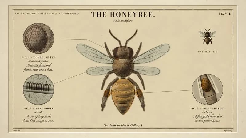
一张博物志图版自己刻出来:雕刀推开铜版,蜜蜂一线线成形,最后手工水彩上色。
- 适合:
- 精细,像老科普书插图
- 系列:
- L Lemo-Opuscar
- 更新:
- 2026-10-29
风格提示词
Copperplate Engraving — Style Prompt
An intaglio plate that engraves itself: a burin cuts swelling lines into copper, a proof is pulled, and the figure builds up — outline, hatching, cross-hatching — until engraved lettering, magnified details and a hand-laid wash make a finished plate.
References (grammar only): 19th-century natural-history plates — Haeckel, Audubon, Westwood, the Britannica copperplates (centred subject, numbered roundels, roman title over an italic name, "del." / "sculp." credits, the plate mark); Hogarth and Doré for the burin line (hatching that follows the form, crossing only in half-tones); hand-coloured plates for washes laid after printing. Never copy a plate, pose, border or title.
1. Essence, and what it is not
An intaglio print: the line is ink held in a groove a burin cut into copper. Three rules:
- Tone is made of lines, never of fills. Light is bare paper; half-tone is one family of parallel lines; shadow a second family crossing it; the deepest dark a third, lozenge-making family. No grey fill anywhere in the ink.
- Every line swells and tapers. The burin enters fine, bites deeper mid-run and lifts out to a point. Lines thicken where the form turns from the light and vanish where it faces it; contours are cut in several runs and thin where runs hand over. A uniform-width line reads as a pen or vector drawing — never.
- Colour comes afterwards, by hand: transparent watercolour laid flat region by region over the finished black print, spilling past the lines, pooling at its edges, ink always on top. A film may stay monochrome long; colour arriving is an event.
Not a woodcut (black block, white gouges — woodcut), not a pen sketch (loose broken lines — urban-sketch), not an engineering drawing (blueprint), not a sepia filter.
2. Materials & rendering
- The sheet is the world: 1920×1080 world units of laid paper (cream, ~
#f1e8d2) with world-space texture (fibres, laid lines, sparse foxing) that zooms with the camera; a pressed, bevelled plate mark and a ruled border (rule + hairline) frame it. - Ink is one warm near-black (~
#1c1510). Width ratios: outlines heaviest (swelling ×0.45–1.35), first hatching from a hair (~0.18 px) to ~2 px, crossing ~0.8×, third family ~0.6×, hair and stipple finest. Spacing is relative to the figure (~1/180 of its height, a little wider per later family) so small figures never go grey. - Swell law for every hatch line: width × (0.2 + 0.8·sin(πu)^0.7), tapered over its first and last ~22 %. Families switch on by tone thresholds (~0.14, ~0.5, ~0.75 on a 0–1 tone).
- One light direction for the whole film (upper left by convention); heavier outlines away from it; tone fields come from the shape (pillow lighting, analytic spheres and cylinders), never from texture. Occlusion is geometric: lines stop at the shapes in front.
- Roundels: double-ruled circle, ruled-machine ground with a white halo round the subject, content authored at a large radius and scaled in. Leaders: hairlines from a dot on the part to the rim, routed with clearance, a small italic figure number at the root.
- Hand colouring multiplies over paper and under ink: a few px of spill, slight misregister, tide-line at the wet edge, low-frequency density lift, occasional backruns, granulation; each region blooms from where the brush touched.
- Copper (when shown): polished warm metal, polishing hairlines, a soft reflected window; grooves = dark trough + bright burr toward the light. The burin (lozenge steel shaft, bevelled face, mushroom handle) is held low and turned ≤ 15° off the line so the fresh groove shows; swarf is a narrowing ribbon curling ahead of the point, one edge lit.
3. Colour logic
- The print is two values, paper and ink; all tone is line density.
- Colour is transparent wash only, in muted earth and mineral pigments, one stronger pigment at most. Never opaque, never on lettering, rules or paper outside the figure.
- Reserve it: the whole subject at one moment, or only the part that matters — or none.
- Example wash sets: an amber insect with blue-grey wings; a map with a sea-green coastal band on buff land; one madder-rose organ on an otherwise black anatomy plate.
4. Type & subtitles
- Lettering belongs to the plate: roman capitals (Bodoni Moda; title ~44–56 px, wide tracking; labels ~15–19 px), italics for scientific names (~20–24 px), script (Pinyon Script) for notes, fixed size, balanced over two lines, never shrunk.
- Roman letters are cut glyph by glyph; script is written in one left-to-right stroke. Nothing fades in.
- Subtitles: script on a deckled paper slip, bottom centre, ≤ 2 lines, never over a label. Hold ≥ max(1.8 s, speech + 0.6 s). An engraved note stays in frame chars ÷ 12 + 1 s from when it starts writing.
5. Motion quality
- Cutting order is the animation: outline → first hatching sweeping across each form → crossing → darks, hair, stipple. Strokes run at constant burin speed, many at once (a few for outlines, dozens for hatching).
- A long single stroke may be followed by the camera; start it partly cut so no frame is empty. Keep a full build to a few seconds.
- Roundels fly on an eased arc with a small lift, growing log-linearly to size. Colour blooms from one point with a ragged front and a wet rim that dries; regions staggered.
- Nothing fades or slides like UI: lines are cut, text cut or written, colour blooms, sheets are pressed, peeled or laid down.
6. Camera grammar
The camera is a loupe over a sheet. A vocabulary, not a route. Opening and ending come from the topic.
| Move | Expresses | Can serve |
|---|---|---|
| Loupe following the burin tip | One point of attention; making | a first mark; a signature |
| Log-zoom pull-out | The line was part of something larger | scale reveal; context |
| Push to a part, ride with its roundel | Where → what, in one take | an invisible detail; a mechanism |
| Tilt/pan along the sheet at reading zoom | Labels in order | a parts list; a coastline |
| Pull back while something flies | Everything placed in relation | acceleration; summary |
| Locked frame, or a ≤ 2 % breathing push | The plate as document | reading time; colour moving |
| Raking view across the copper | The groove as depth | the cost of craft |
| Cut from mirrored copper to true proof | Reversal | a hidden truth; before/after |
Framing: subject inside the plate mark, labels and roundels in the margins; order details so push-ins never crop a note early. Transitions from printmaking only (proof pulled, tissue guard laid over, region burnished out and re-cut, new sheet on the bed); no dissolves or wipes.
7. Sound palette
- Foley by material: paper (peel crackle, slip tapped down, tissue rustle, sheet whoosh); press (roller rumble, thump); copper and steel (high band-passed burin hiss with chatter and faint plate ring, swarf pings, a tick on lift, circular scribe, burnishing rub); ink and water (pen scratch, ticks for cut letters, a water plip and wet brush swish). Hatching = micro-scratches denser each pass.
- Room: a quiet workroom (faint clock), paper room once the print exists.
- Instruments (choose): harpsichord, string quartet, solo cello or viola da gamba, lute, chamber organ, glass harmonica for a cold subject. Plucked and dry while lines are cut; bowed or sustained only when something soft arrives; tiny tings for a scribed ring, a low pluck on landing.
- Silence is real: cut room tone too, keep at most one small sound.
- Mix: melody an octave above the voice, music ~half under speech, −14 LUFS. Voice: a quiet curator or naturalist.
8. Native moves
A menu: use the ones your story needs.
- The cut. Burin mid-stroke, swarf rising, nothing else. Fits: the first line of a treaty; a watchmaker's scribe; a coast being charted.
- The three passes. Form gains volume pass by pass. Fits: a building from its plan; a portrait emerging; a skill improving.
- Magnification roundel. Ring scribed, burnished, re-cut larger, flown to a margin with a leader, label cut on landing. Fits: a gear in a clock; a pollen grain; a harbour inset on a chart.
- The proof. Sheet peels off; mirrored copper becomes true paper. Fits: a secret out; a draft made final; a coin's die and strike.
- States of the plate. A region burnished out and re-cut. Fits: a border redrawn; before/after; a design revision.
- Hand colouring. Washes bloom after the print. Fits: one organ lit; a flag on a historical map; a ripening fruit.
- Natural size. A tiny true-scale figure beside the engraving. Fits: a seed by its tree; a chip by its circuit; a stamp by its enlargement.
- The finished plate. Every label and credit, locked. Fits: a museum label; a frontispiece; a certificate.
9. Pitfalls of the medium
- Uniform width reads as pen → swell hatches, pinch contours between runs (
hatch({swell}),outline({run, pinch})), keep wMin hair-fine. - Overlaps without occlusion → pass occluders as
excl(subtracted ring by ring; even-odd would cancel overlaps). - Outline-only parts beside a hatched body → hatch along each part's axis, a dark at every joint.
- Burin along the cut hides the groove; big skew looks like poking → ≤ 15°. Regular swarf helix reads as a spring → vary winding, twist, light one edge.
- Reflections over grooves wash them out → copper light first. Roundels authored small freeze sub-pixel → author large, scale in. Leaders hugging the subject read as crossing it → clearance.
- A long early stroke never draws → the ink's early exit must look ahead by the longest stroke.
- A push-in cropping a fresh note breaks the reading rule → put consecutive details on one side.
- Scientific names: TTS may manage, ASR won't → give the checker a plain spelling.
10. Engine
demo/engine/: burin.js (B.Ink ordered stroke store + schedule, B.hatch, B.engraveTone, B.contourHatch, B.outline/B.stroke, B.stipple, B.fur, tone fields), plate.js (drawSheet, engraveText, writeScript, roundelFrame), wash.js (Wash), copper.js (copper, burin, swarf), index.js (engraveShape(svgPath, {at, light, spacing, style}): any SVG shape → engraved figure). demo/example/index.html engraves and colours a four-pointed spark in ~20 lines; code and function table in DEMO.md "Engine reference".
11. Variation space
You decide subject, details, order, opening, ending, camera path, colour, pacing and music. Use cases are grammar for the order and duration of information; build your own timeline from the user's facts.
| Use case | Information order | Hold per layer | Length |
|---|---|---|---|
| Museum label / case screen | title + scientific name → detail + term + note (×N) → where to see it | title ≥ 2.2 s; note ≥ chars/12 + 1 s; final ≥ 4 s | 30–40 s |
| "One minute on …" | question → name → 2–3 facts → one number → follow prompt | number ≥ 2.5 s alone | 35–60 s |
| Textbook figure | figure → parts labelled one by one → caption | label ≥ chars/12 + 1 s | 20–45 s |
| Craft heritage | object → 2–3 craft details → maker / edition | as above | 30–45 s |
| Map / site plan | place → insets → legend → visiting info | inset ≥ 3 s; legend ≥ 4 s | 30–45 s |
All far from our demo:
- Structures: states of one plate (one view re-cut three times as a place changes); a book of plates (four small plates turned like pages, one fact each, no roundels); a dissection (parts labelled in teaching order, colour only on the part taught).
- Openings: the finished proof burnished back to its first line; on paper at 1× (title cut first, figure grows below); raking light over blank copper as the design is traced.
- Endings: plate beside its proof; the natural-size figure held alone; a blank new sheet laid on the stack.
Swapping demo/content.json and rebuilding is a technical check that the engine re-flows, not a way to make a film.
How our demo was made (story, shots, score, end card, build, content fields): DEMO.md. Read it after your treatment exists.
补充
示范片
The Honeybee, Plate VII
本风格的来源项目:开源项目 Lemo-Opuscar(项目仓库)。本站保留原项目署名,具体许可以该项目仓库为准。
分享来源:B 站视频(341 种代码动画风格)