
 L Lemo-Opuscar
Risograph 丝网印刷
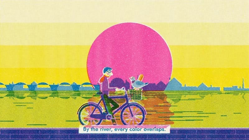
周日早晨骑车穿过城市:面包店、公园、河边,每到一处加一版油墨,最后三版套印。
- 适合:
- 杂志感、潮
- 系列:
- L Lemo-Opuscar
- 更新:
- 2026-10-29
风格提示词
Risograph Print — Style Prompt
Animation that looks printed, frame by frame, on a stencil duplicator: two or three translucent spot inks overprinted on warm paper, halftone dots, ink grain, and plates that never quite line up.
References (grammar only): Tom Haugomat's riso illustrations (colour fields and silhouettes, a small figure in a large world, extra colours made by overprinting); Jacques Tati's Jour de fête (comedy staged small in a wide frame, everyday sounds as rhythm); real riso prints (translucent inks, misregistration, pinholes, feed streaks). Copy none of their characters, compositions or palettes.
1. Essence, and what it is not
A risograph prints one colour at a time: each colour is its own stencil ("plate") with its own drum of translucent ink. That one fact makes the look:
- A tiny palette: 2–3 spot inks on warm off-white paper.
- Overprint mixing: inks multiply, so two inks make a third colour and all three approach black; a tint of one ink over a solid of another gives the brightest mixes.
- Misregistration: every plate lands a few pixels off; edges show slivers of paper or a coloured halo.
- Halftone dots for mid-tones, each plate on its own screen angle; imperfect ink: pinholes in solids, streaks along the feed direction, blotchy density.
- Flat shapes, no outlines: forms are colour fields and silhouettes.
Not flat vector art with a noise overlay (every colour comes from the plates), not CMYK pop-art halftone (no process colours, no keyline), not screen-print posters (riso ink is translucent and grainy, not opaque). Never show the RISO brand, logo or machine trade dress; ink names are colour references only.
2. Materials & rendering
Pipeline. Draw each frame into one RGB canvas where each channel is one plate's density (R = ink 1, G = ink 2, B = ink 3; 0 = none, 1 = solid). source-over gives true knockouts; globalCompositeOperation = 'lighter' adds ink only to the channels you set: a true overprint. A WebGL2 shader "prints" it:
- per plate: offset in px + tiny rotation → misregistration;
- halftone: cosine spot function on a rotated grid, period ~6–8 px at 1080p, anti-aliased threshold; densities ≥ ~0.9 print solid; screen angles ≥ 15° apart;
- grain on the dot threshold, pinholes in solids, density varying with a feed-direction streak and a slow blot noise;
- composite
paper × Π mix(1, ink_i, coverage_i), with faint paper fibre; - dots anchored to the paper (screen), not to objects: a pan slides the image under a fixed screen, as if each frame were printed anew;
- a per-plate gate and a roller sweep (moving edge, slightly heavier ink band) let a plate arrive mid-shot.
Composition rules.
- Every area uses at most two plates, at most one of them as a tint. Three halftones on top of each other = mud.
- Big flat shapes, lots of solid paper and solid ink; halftone in a few stepped bands (e.g. 20 / 40 / 60 / 100 %) for skies, shadows, distance.
- Characters get a paper-white knockout halo (4–5 px): stamp their layer in a ring with
filter: brightness(0)(zero ink = paper), then draw them. Plates misregister around it, so it picks up coloured fringes like a real trap. - One horizon, one big flat field or disc, one small figure; the figure's head against the flattest colour in the frame.
- Design for the one-plate version: every main colour contains some of the first plate, so a one-ink frame still reads as a complete silhouette. A deliberate exception stays blank paper until its plate arrives: a reveal.
3. Colour logic
- 2–3 spot inks, never more, plus paper; every other colour is an overprint or a tint. No gradients except stepped halftone.
- Pick inks whose pairs mix into useful colours; at least one must carry a silhouette alone.
- Paper is warm off-white (around
#F4EEE2), never pure white; paper white is a colour too (knockouts, highlights, subtitles). - Light neutral surfaces (skin): a light tint of the palest ink. Dots of a saturated ink on skin look like a rash.
- Save the full overprint (every plate, densest mixes) for the moment that earns it.
- Example ink sets: Blue
#0078BF+ Yellow#FFE800+ Fluorescent Pink#FF48B0; Teal#00838A+ Fluorescent Orange#FF7477; Federal Blue#3D5588+ Red#FF665E+ Sunflower#FFB511.
4. Type & subtitles
- Type is printed: titles and subtitles live on one plate, so they misregister and grain with it. A title can be printed on two plates with a visible offset: the riso double-hit.
- Fonts (OFL): heavy grotesque for titles (e.g. Bricolage Grotesque 800), geometric sans for captions (e.g. Jost 500–700). Preload every weight before
READY. - Subtitles: a paper-white knockout strip (zero ink, small radius) with text on one plate, ~40–46 px; its edges catch misregistration fringes. Hold ≥ max(1.8 s, speech + 0.6 s).
- Prints don't fade: titles arrive with a roller wipe or on a beat and leave on a cut.
5. Motion quality
- Characters act on twos (12 fps); camera moves on ones (24 fps): a stepped camera reads as judder.
- Registration is not jittered every frame. One fixed set of offsets per shot (±1–3 px). A kick (≈ 8–14 px, decaying in ~0.25 s with slight ringing) on an accent; a drift up to ~25 px through a held moment, snapping back on the downbeat.
- Grain boils partly (about a third re-rolls per print); sheet streaks and blots change only at cuts.
- Simple cycles on few drawings; secondary motion (scarf, flag, tail) as a travelling sine wave.
6. Camera grammar
A vocabulary, not a route. Opening and ending come from the topic.
| Move | Expresses | Can serve |
|---|---|---|
| Wide lateral tracking, small figure, empty sky | Travel, routine, room | a commute; a process line; a title |
| Static wide, the subject crosses the frame | Comedy of scale | a gag; an arrival; a crowd |
| Locked composition: horizon, disc, figure | Stillness, awe | a decision; a reveal; the film's one pause |
| Ground-level low angle, big foreground shapes | Energy, abundance | a burst; a harvest; a launch |
| Medium two-shot held for a look | Reaction | a joke landing; a deal; a disagreement |
| Straight top-down, long shadows | Pattern, a map | a schedule; a floor plan; a game board |
| Push into a halftone field until dots are shapes | Entering the print | a close look at data; a memory; a cell |
| Pull back to reveal the paper | It was one sheet | a series; an archive; a summing-up |
| Match cut on a flat shape | Continuity through form | a time jump; cause and effect; before/after |
Framing: lots of paper and solid ink, text on empty sky or a knockout strip. Transitions: overprint growths, roller sweeps, shape match cuts, hard cuts on beats. Never a cross-dissolve, never a soft digital wipe.
7. Sound palette
- Instruments, as options: warm, dry, handmade, slightly lo-fi: upright or electric bass, vibraphone or marimba, nylon guitar, whistled or hummed melody, Rhodes, toy piano, brushed kit, shaker and rim clave, a small drum machine through tape saturation.
- Layering like plates (an option): each new plate brings one instrument, and they can leave one by one.
- The machine is the signature foley: feed "shhk", drum "ka-chunk" at a plate arrival, motor hum, a sheet landing on a stack, a guillotine cut. Other foley dry, close and papery, following the story's materials.
- Silence: a held bar with reverb tails cut, at most ambience or one distant sound; it pairs with a registration drift, and the snap brings everything back.
- Mix: dry and close; music ducks ~8 dB under voice; −14 LUFS. Voice relaxed and conversational, short lines, verified with whisper. No grain added at mux: it is in the print.
8. Native moves
A menu: use the ones your story needs.
- Plates as narrative. The world gains a plate at each turning point. Fits content like: a product arriving as a new ink; a city history, one ink per era; colour returning during a recovery.
- Two inks, a third where they meet. Fits content like: a merger; a duet; two data sets whose overlap is the finding.
- Overprint transition. A shape of one ink grows over the frame, turning everything beneath into the mix, then shrinks into the next scene's key shape. Fits content like: a pill dissolving; a spotlight becoming a moon; a stamp becoming a map pin.
- Registration as rhythm and feeling. Kicks on accents, drift in a held moment, snap on the downbeat. Fits content like: nerves before a speech; dizziness; a memory coming into focus.
- Reflections as separated plates. Each plate wobbles on its own phase. Fits content like: a shop window; heat over a road; a coffee surface.
- Knockout reveal. A shape made only of missing ink; its plate arrives later. Fits content like: a missing piece; a secret; a logo hidden in plain sight.
- Halftone scale. Dots grow into shapes as the camera pushes in. Fits content like: population; rainfall; a crowd that turns out to be people.
- It is a sheet of paper. The print can be stacked, folded, cut or pinned; grain boils like a flipbook of prints. Fits content like: a zine; a poster series; a flyer passed hand to hand.
9. Pitfalls of the medium
- Three halftoned plates in one area = mud → two plates, one tint.
fract(p*vec2(233.34,851.73))draws vertical stripes across solids at 1080p → a well-mixed hash (fract(vec3(p.xyx)*.1031)family).- Per-frame registration jitter and sheet streaks flicker and blow up file size → fixed offsets per shot, kicks on accents, sheet noise at cuts, partial boil.
- JPEG screenshots (4:2:0) smear saturated dots → PNG frames into a lossless yuv444 intermediate, encoded once with
-tune grain; check at 100 % and 50 % for moiré. - The halo layer must copy the canvas transform, or zoomed shots draw the subject at the wrong scale.
- Additive
over()inside a transparent layer loses its meaning → overprint on the plate canvas. - A main colour without the first plate floats loose in one-ink frames → build palette recipes up from the one-ink silhouette.
evenoddfills of arches fill solid → trace the inner edge in the opposite direction.
10. Engine
In demo/: riso.js (print shader: plates, halftone, grain, registration, kicks and drift, gates, roller sweeps, reflection wobble), draw.js (ink(b,y,p) densities, over() overprint, layer() paper halo, 2-bone IK, limbs), sheet.js (model sheet with a "plates = story" row via S.mask), tools/video_png.mjs (PNG frames → lossless intermediate), tools/mux.sh. Minimal new frame: two plates (R = teal, G = orange); a solid teal hill, an orange disc drawn with lighter so it darkens where it crosses the hill, a 40 % teal sky band, a figure knocked out with layer().
11. Variation space
You decide the inks and what each plate means, the structure, characters (or none), opening, ending, camera path and pacing. All far from our demo:
- Structures: two inks in dialogue (two subjects alternate shots and only overlap at the end, making the third colour); subtraction (start at full overprint, lose a plate at each loss, end in one ink); a zine (each shot a page turned, each page a different two-plate pairing).
- Openings: a knockout (a blank shape in a full-colour field, filled by its plate seconds later); dots first (extreme close-up of halftone that pulls back into an image); ghosts converge (three colour ghosts drift together and snap into a readable frame on the first beat).
- Endings: one ink left (plates lift away until the last line stands in one colour); the print on a wall (the last frame becomes a poster pasted up inside the world it showed); a folded sheet (the print folds into something the story needs: a boat, an envelope, a ticket).
How our demo was made (story, shots, score, end card, build): DEMO.md. Read it after your treatment exists.
补充
示范片
Sunday Ride
本风格的来源项目:开源项目 Lemo-Opuscar(项目仓库)。本站保留原项目署名,具体许可以该项目仓库为准。
分享来源:B 站视频(341 种代码动画风格)